



Why it matters for carpet tile buyers
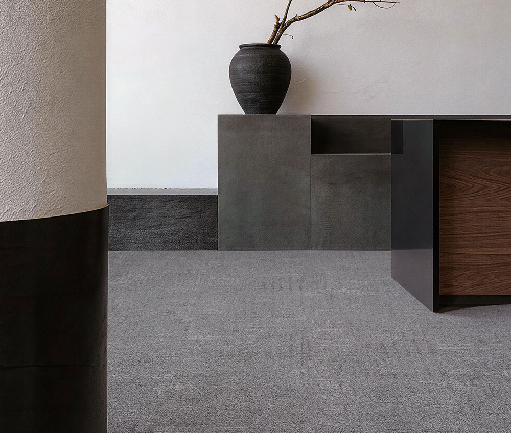
Commercial carpet tile colour is read at room scale, not from one swatch. A useful brief connects reception, workstations, circulation and meeting zones with module format, orientation, existing finishes and maintenance/replacement planning.
What to check
Ask for the product code, colourway, module size, intended layout pattern, adjacent finishes and representative room image. Review samples under the project lighting and keep the final selection tied to the specified product identity.
A project example
For a reception with warm stone and timber, place two warm-neutral carpet tile samples beside those finishes under the actual lighting. Compare undertone, contrast at the entrance and the permitted laying direction. Then choose the exact product and colourway for the finish schedule.
Next step
Turn a visual reference into a zone-and-layout brief, then browse live product options and request samples against the actual project conditions.
Primary source
Interface — Open Air™ Neutrals expansion
2026-05-12