



Office Carpet Colour Schemes: Start With Light and Dark
TL;DR
Choose the lightness pattern of an office carpet floor before choosing a favourite grey or accent colour. Give the largest area a base value, use a clear change where one zone should read differently, and test physical carpet tiles beside the room's walls and furniture in daytime and electric light. Record the exact colourways and layout when the palette works at room scale.
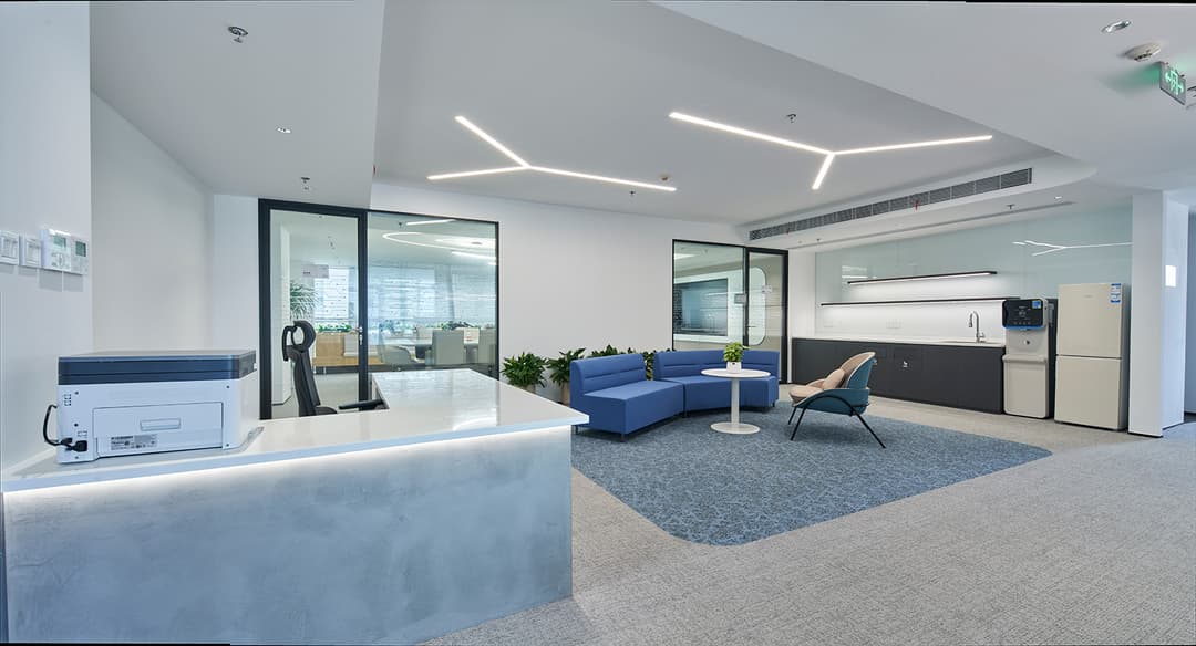
Sketch the floor in three values
Make a quick floor plan using only light, mid and dark tones. This reveals whether the scheme feels balanced before undertones and accent colours complicate it. A mostly mid-value floor can be interrupted by a darker route or a lighter meeting zone; the proportions depend on what the room should emphasize.
Grey is not one colour. A warm grey can sit differently next to timber than a cool grey beside blue upholstery. Use the drawing to choose where contrast is useful, then look for carpet tile samples that express those values.
Give each office zone a role
| Zone | Possible palette role | Check on site |
|---|---|---|
| Reception | A base tone with a deliberate accent at the point of arrival. | How the floor reads beside the desk, wall finish and daylight. |
| Open work area | A calm mid-value field that can connect several furniture groups. | How repeated modules look across a larger sample area and under the working lights. |
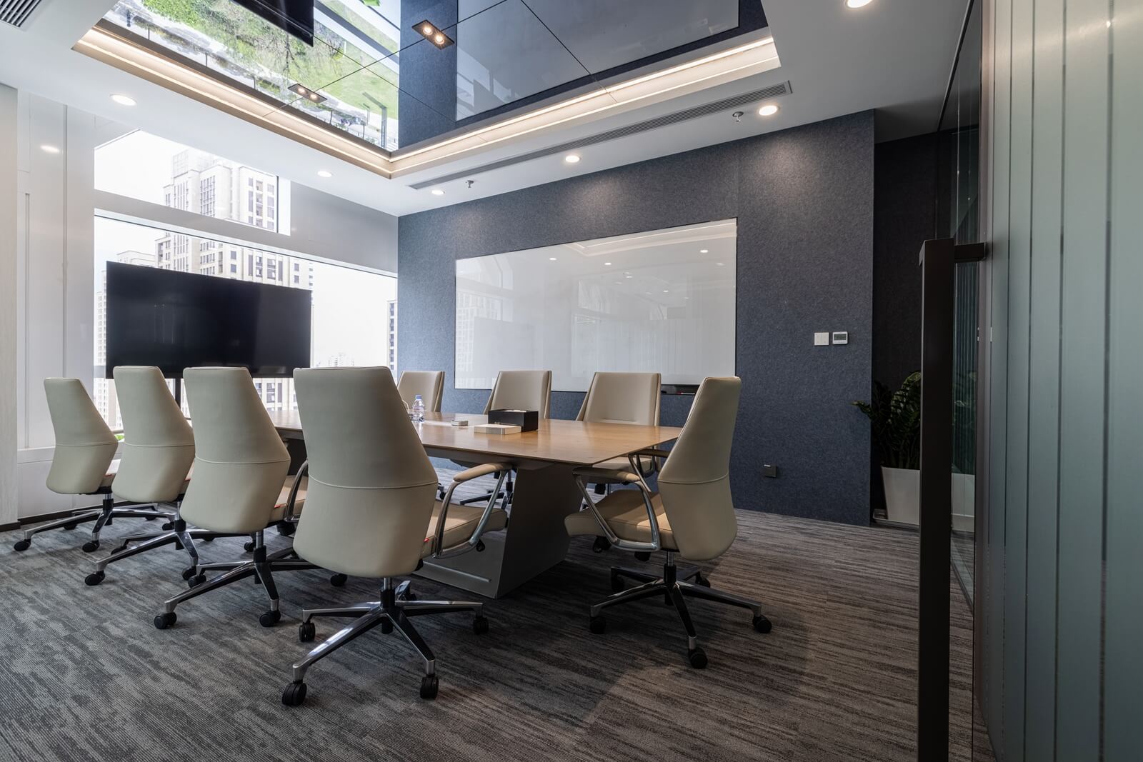
| Meeting room | A shift in value or texture that marks a quieter room. | How the tone works with table, chairs and any transition at the door. |
| Circulation | A darker or more varied route if the design calls for visual definition. | Soil at entrances, maintenance and whether the change remains clear from the main sightline. |
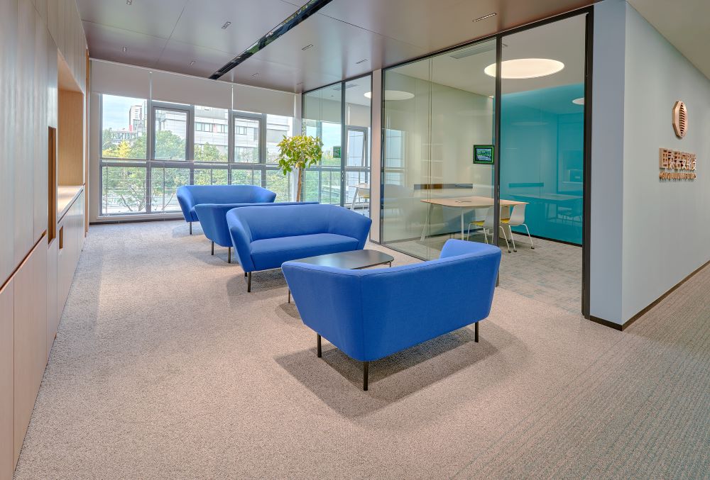
Test colour in the actual room
Place more than one tile on the floor, orient them as proposed and step back to the distance from which the space will normally be seen. A small vertical swatch next to a screen cannot show the scale of a repeated floor pattern.
View samples beside the actual wall, furniture and other floor finishes. Check both daylight and installed light, and photograph the same arrangement under each. Lighting can alter how a grey or accent reads; choose with the project's viewing conditions in mind.
If colour helps identify a route or a zone, review it as one cue within the wider signage and accessibility plan. A floor colour alone should not carry a critical navigation instruction.
Turn the palette into a product choice
- Draw the large, medium and small areas of the floor, and assign each a light, mid or dark role.
- Browse current collections for physical samples close to those values; record exact style, code and colourway.
- Test a representative group of tiles with the proposed direction and neighbouring finishes in the room.
- Adjust the balance, then record the approved samples, layout and lighting conditions for procurement.
- Check availability and the current product documents for the chosen codes before ordering.
Browse carpet tile collections · Plan the layout pattern · Request colour samples
Frequently asked questions
What is a good office carpet colour scheme?
One that gives each zone a clear visual role and works with the room's finishes and light. Start with light, mid and dark values, then test actual samples at floor scale.
Should every office use grey carpet tiles?
No. Greyscale is a planning tool for lightness and contrast. The final palette can include warm, cool or saturated colours if they support the design brief.
Can I approve a carpet colour from a screen?
Use the screen to shortlist. Approve the exact physical sample under relevant room lighting, with nearby finishes and the intended layout.
How many carpet tiles should I review together?
Use enough tiles to show the repeat, direction and visual scale that matter to the decision. A strongly patterned design often needs a larger layout sample.
Sources & further reading
- ISO/CIE 11664-1:2019 — Colorimetric observers
- CIE 015:2018 — Colorimetry, 4th edition
- IES — Recommended Practice: Lighting Office Spaces
- IES — Lighting Design Objectives procedure
- UNIJOY — product collections
- Shaw Contract — commercial design palettes (peer inspiration)
Figures attributed to other manufacturers are their own published values, quoted for context. Different laboratories, sample build-ups and substrates are not directly comparable.